Effective online selling is the real art of persuasion. When we sell something online, many things serve as persuasive mechanisms: https://telegram-store.com/catalog/product-category/channels/design, design, user-friendly site navigation and ease of interaction with the information presented, selling texts, page loading speed, beautiful product photos, and much more.
But the deciding factor is visual perception: according to studies, more than 93% of consumers make a decision about buying a new product precisely because of its appearance, and only 6% find tactile sensations more important. One way or another, 85% of all buyers focus on color when choosing various products (according to KISSmetrics infographics).
So can a certain color combination in advertising and website design increase customer activity? Absolutely! For this you should study in great detail your target audience (gender, age, social status, average income, etc.), as well as the meaning and impact of colors. By introducing changes in your company identity, product packaging or website design you can greatly increase not only the number of orders, but also the average bill. How? Let’s understand item by item.
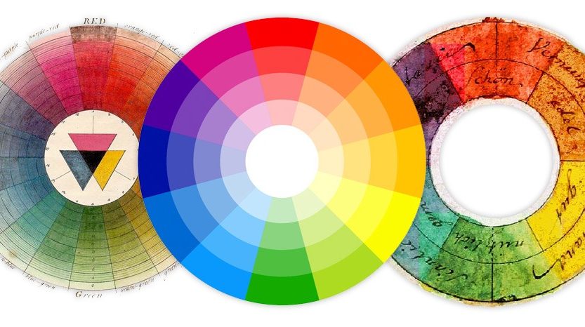
How does color influence customer activity?
Color is a powerful tool in design, but it is very individualized. For example, the colors that most often incline people in the U.S. to buy, can leave totally indifferent Indian buyers.
The impact of color on sales corresponds to the three groups of consumers, which are divided by behavior at the time of shopping:
- Impulsive shoppers.
- Thrifty shoppers.
- Traditional or regular shoppers.
The trigger (purchase provoking factor) for impulsive shoppers is usually red, orange, bright blue and black. Under their influence, impulsive people are more likely to participate in sales and buy fast food.
For thrifty shoppers, the triggers are dark and saturated shades of blue and blue-green. Such calm yet noble shades can be seen on portals dedicated to finance and the B2B market.
Traditional shoppers represent the largest group of consumers. They are exposed to all kinds of shades of blue and blue and pink. That’s why such colors are most often used in the design of online stores of women’s clothing and not only.
The psychology of color perception in advertising
- Red. An energetic, but aggressive color that promotes heart rate. It is often chosen for sales due to the “urgency” effect.
- Orange. Color call to action. It is well suited for the button “Register”, “Order”, “Buy”, as well as for accents on the page.
- Yellow. Optimistic and happy colors. He well attracts the attention of visitors to the right sections or important information.
- Blue. Perhaps one of the most popular colors used in web design. He gives a sense of reliability and causes confidence on a subconscious level. This is a favorite color of financial institutions, insurers and large companies.
- Black. It has a powerful effect, so it is traditionally used to promote exclusive and expensive items (jewelry, designer clothes, luxury cars, etc.).
- White/Gray. The associations they evoke are purity, freshness, virtue. These colors are actively used on sites devoted to health care, charity, closet, wedding preparations. White, for example, was chosen by: the world-famous online store Asos, brands Ralph Lauren, Apple and others.
- Green. One of the most natural colors for the human eye. Many people associate it with health, stability, freshness and harmony. Green is soothing and relaxing. It helps to promote dietary supplements, medical equipment, baby products, education courses and trainings. Green is also used on a par with blue for sites on the topic of finance.
- Purple. The color of tranquility, peace, beauty and youth. Perfect for advertising the beauty industry (beauty salons, cosmetics, massage rooms, spas, etc.) and a number of industry areas.
- Pink. Color of femininity and romance. It is often used to design sites aimed at women and young girls (cosmetics, accessories, shoes, clothing).
Choosing the right color in site design as a cherry on the cake. But if it’s delicious, it does not mean that the whole dessert will be like that. If your portal has a cool combination of colors in accordance with the characteristics of your target audience, but there is a slump in the other parameters, most likely, you will not see a positive effect on sales.